When analysing processes, the Pareto Chart is a useful tool for charting the relation between the cause and effect of problems. The theory behind the Pareto Chart dates back to 1897 when Italian economist Vilfreda Pareto developed a formula for describing the unequal distribution of wealth in his country. It later became known as the 80/20 rule.
You have probably heard people say that “20% of customers are responsible for 80% of trade”. When this is applied in Lean Six Sigma, the resulting graph is called a Pareto Chart.

The Pareto Chart is a simple way of illustrating where the bulk of the problems in the process originates. If a Pareto Chart is applied early in the improvement process, it can be used as input for devising an effective strategy for reducing the complexity of the project.
In this article, we will use two examples to demonstrate how the Pareto Chart can be applied to various processes. The first example illustrates how the Pareto Chart works in production, while the second relates to the service sector.
Pareto Chart (production)
Most of the defects in a process follow a certain pattern, with a relatively small number of problems causing the bulk of the defects.
The Pareto Chart displays the relative frequency of problems in order of defects, thereby creating a summary of the problems with the highest priority. The best results can be achieved by tackling and improving problems based on these priorities.
The below image demonstrates how the 80/20 rule works.
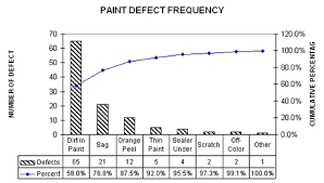
It clearly indicates which defects need to be addressed first. The first three categories (dirt in paint, sag and orange peel) are actually responsible for 87.5% of the defects.
A Pareto Chart can be created using any virtual spreadsheet or charting software. Excel is a prime example.
Pareto Chart (service)
Besides being suitable for production processes, the Pareto Chart is also an ideal tool to apply to the service sector in order to determine which problems should have priority and be solved first.
The below example demonstrates how the principle works in the service sector. The left axis displays the number of complaints, while cumulative percentages are reflected on the right.
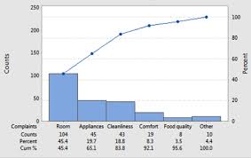
This example demonstrates that complaints related to the room, layout and hygiene are responsible for 83.8% of total complaints. A logical conclusion would suggest that management focuses on these categories on this basis. However, care should be taken when choosing priorities. Sometimes, the cause of a complaint cannot be quickly or easily resolved. At such times, it may be worth considering other problems.
An example: instead of complaints about the rooms, there could be complaints about reservation waiting times. A reason for these waiting times could be the use of an outdated reservation system. If this will not or cannot be replaced in the near future, it would be better to focus on solving a different problem.
Other options
There are also other ways of arranging the Pareto Chart. For example, you could emphasise costs relative to the number of complaints, or the time taken to solve a problem. Every way of looking at it leads to different results and solutions, so the best method depends on the situation that applies within the organisation.
Pareto Charts can also be used for cause/effect diagrams or as input for e.g. brainstorming sessions aimed at identifying the underlying causes of problems. Thanks to its segmentation action, the Pareto Chart can provide insight into the main problem areas and can point the improvement team, which will eventually solve the problems, in the right direction.